BlogDesigning
Discovering Your “Language” To Brand Design
The trend in design changes frequently. At times, between a gap of 10 years and, rest until a company like Google decides to disrupt the concept of design, eg. the recent material approach to mobile-first designs. But in between all fuss, there is always a "language" to how a brand…
 The trend in design changes frequently. At times, between a gap of 10 years and, rest until a company like Google decides to disrupt the concept of design, eg. the recent material approach to mobile-first designs. But in between all fuss, there is always a "language" to how a brand adapts a new face. This "language" is the mark of consistency and original face of a brand. Everything else comes on top of it. This consistent portion of translative design is what empowers a brand.
  The above image shows seven iterations of the Windows logo from Microsoft. They all are different in broad design. Windows 3.1 logo from 1992 is a basic artwork of a glass window. Between Windows 95 and XP, the design saw a tilt in its orientation. From Vista, Microsoft adopted this glossy-emboss approach to its design. Windows 8 became a lot simpler, flater - given the flat design trend in late 2012. It took 25 years of design evolution to get Windows 8 logo from Windows 1; a gap between 1985 and 2012. But if you look closely, Windows logo has always been about the "+" shaped separators, while the four glass panes kept changing. This was Microsoft's "language" for Windows. A person knows it is a Windows logo when he sees one - this is Microsoft Windows' brand power.
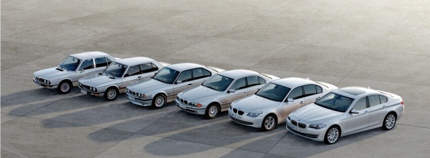
 A company’s brand is consumers’ perception of that company.Similarly, BMW would be a great example of design consistency over a really long time. They have managed to change their car designs from vintage boxes to right-out-of-sketchbooks hybrids like BMW i8. Yet, keeping their signature front grill and logo same. For over 50 years, people have recognised a BMW without failing, thanks for their "language" atop modern design.
 We will not go short of examples for this phenomenon of consistency in design. There is Apple, UPS, Mercedes-Benz and Pepsi to name the popular ones. But how do a brand find their "language" to design?
